Association for Regional Development and Mental Health
Website Building
Gaining access to a person’s home marks a significant threshold in understanding their essence. It represents their personal space, a sanctuary on earth that encapsulates their true world and offers a designated realm where they can establish their individual principles.
Creating a website is like building a house, commencing with the foundation, and meticulously embellishing the walls with intricate details.
Digital architects?
A strong foundation is crucial for maintaining stability in any house. Interestingly, this metaphor holds true when discussing website development, as there are notable similarities between the two.


EPAPSY stands as one of Greece’s largest non-profit mental health service organizations.
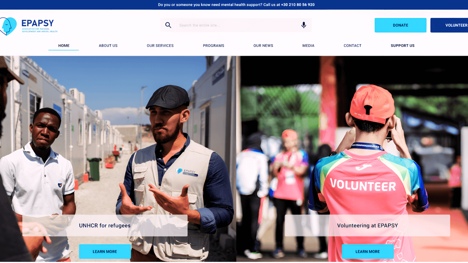
Among our team’s most recent and significant undertakings is the design of EPAPSY’s new website.
Our primary goal was to craft a website centered around human communication dedicated to informing the public about EPAPSY’s diverse identity encompassing various initiatives, programs, podcasts, and scientific endeavors. Additionally, we emphasized facilitating public support through donations, volunteering, and sponsorships.
The initial step for us was to comprehend the User.
Before delving into the design process, gaining a deep understanding of EPAPSY’s essence and core values was imperative.
To begin, our team interviewed the Founder and President of EPAPSY, which served as a guiding principle for our objectives in creating the website. We also sought feedback from other stakeholders and conducted interviews with them.
After thoroughly examining the briefs stakeholders provided, we extensively researched similar mental health websites and organizations.


Design
During the design phase, the menu held significant importance. By incorporating the initial guidelines, stakeholder feedback, and gathered data, we developed the initial version of the site map.
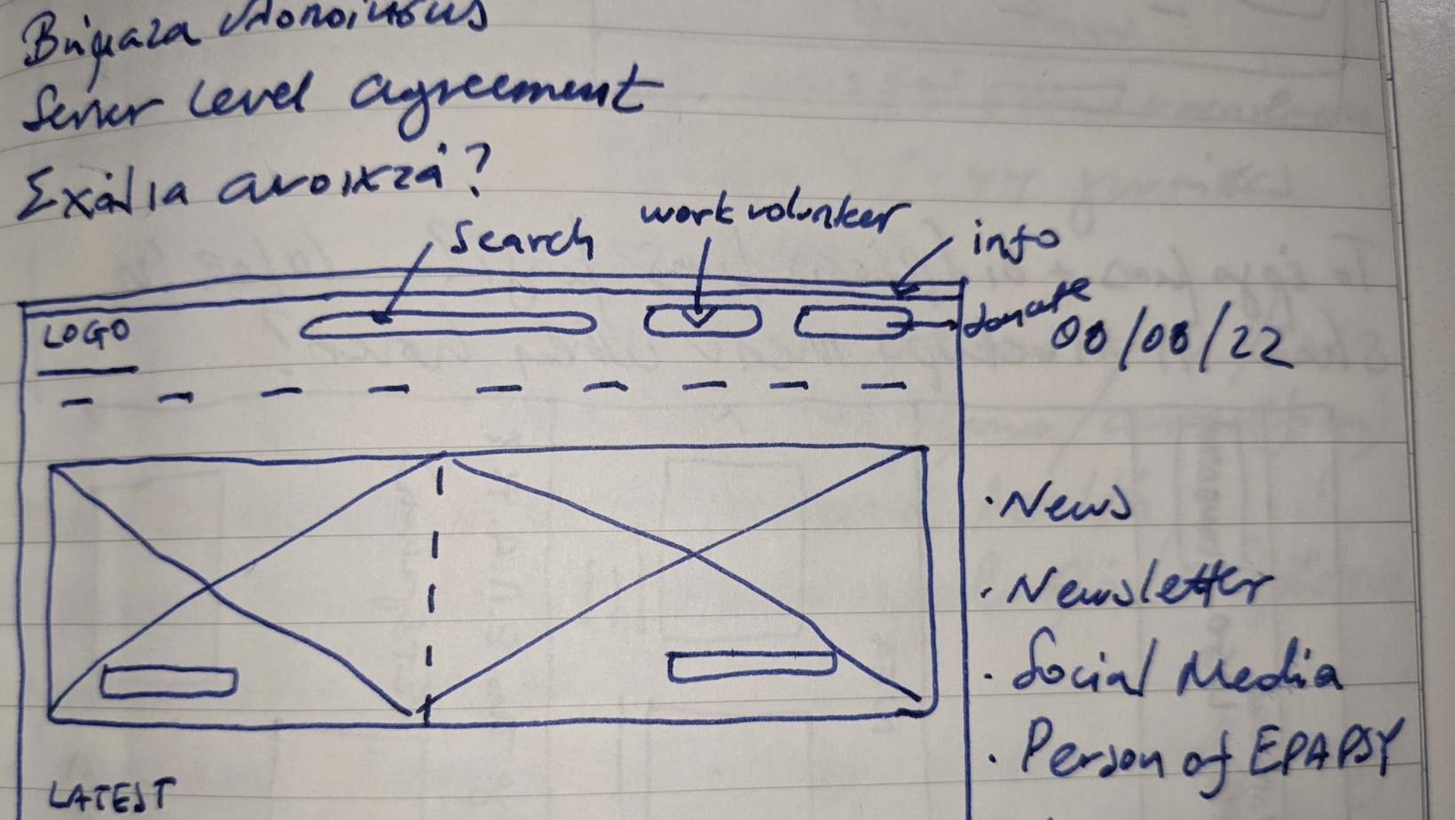
To visualize the idea, we began by sketching the initial draft of the cables on paper, creating the foundational shape of the design.


Low-fidelity Wireframes


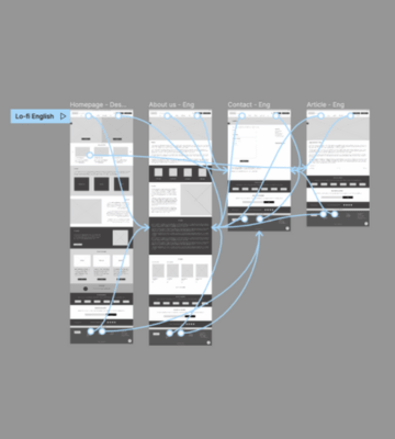
The team’s Visual & User Experience Designers proceeded to the subsequent phase, which involved crafting digital wireframes using Figma, emphasizing creating a low-fidelity prototype optimized for desktop computers.
Swiftly, the team designed the initial set of pages, encompassing the Home Page, About Us, Contact Us Page and an Article Page.
All team members actively discussed button placements and page organization during this stage. Valuable input was contributed as team members shared their opinions, ideas, and comments, all geared towards achieving the best possible outcome for the first version of the design.


Usability test
The next significant step entails conducting a usability test.
The test involved the participation of 4 women and 5 men, ranging in age from 27 to 65 years and coming from diverse backgrounds. The study was conducted online, and the participants were tasked with browsing the website, responding to questions, and following predefined scenarios. Their experiences at each stage were also solicited for feedback.
After completing the tasks, the participants were asked to rate a series of prepared statements on a scale of 1 to 5, where 1 indicated “Strongly Disagree,” 2 denoted “Disagree,” 3 represented “Neither Agree nor Disagree,” 4 meant “Agree,” and 5 signified “Strongly Agree.”
Based on the findings from the usability study, the main difficult points were identified in the menu and the website’s contact form.
High-fidelity Wireframes
Our team created detailed wireframes for desktops, encompassing the Home page, About Us, Contact Us page, two different landing pages, and an article page. These wireframes are available for your review.
The prototype’s color scheme was carefully selected, drawing from various shades of the EPAPSY logo colors. Blue, widely associated with health-related websites, symbolizes reliability and elegance, attributes that were of great significance to the stakeholders.
To maintain the theme of mental health, the prototype’s images predominantly featured hands, reflecting the essence of EPAPSY as a helpline for individuals seeking mental health support.
As we have shared the website design journey thus far, let’s delve into the key elements that define the outcome in greater detail.
Hence, we proudly present a Website Equal & Fair to All (“Equal for All”).
Throughout the design and development process of epapsy.gr, our focus was on ensuring its comprehensiveness and Accessibility for all users who interact with it.
Consequently, we can identify three fundamental pillars on which this online platform was constructed:
- Accessibility (Equality-Justice)
- Empathy (UX UI)
- Functionality


Accessibility
Our team places significant importance on Accessibility, and we dedicatedly incorporated its principles throughout the website. We aimed to cater to a broader audience, including individuals with visual, auditory, motor, and cognitive impairments by utilizing clear text, proper structure, and ensuring sufficient color contrast.
Modern web design recognizes the criticality of Accessibility, as it ensures that disabled individuals can use websites without any hindrance. The fundamental principles guiding our design approach are equality and fairness. By adhering to accessibility guidelines, we ensured that all visitors, especially those with disabilities, could easily navigate the EPAPSY website, eliminating any barriers and promoting equal access for everyone.
Focusing on Accessibility allows a website to set itself apart from competitors and reach a larger audience, enabling more visitors to explore its services.
In epapsy.gr
– The color choices strictly comply with the Web Content Accessibility Guidelines. Specifically, the website utilizes specific Pantone shades that closely resemble the colors of EPAPSY. This careful selection ensures that individuals with visual impairments can read the content without requiring auxiliary tools. The predominant colors used are light blue, dark blue, and off-white.
Furthermore, significant attention has been given to the contrast between text and background colors. Through successful contrast tests in accordance with the Web Content Accessibility Guidelines, the website ensures that the texts remain clearly visible and legible, even for individuals with limited vision. This commitment to color accessibility contributes to a more inclusive and user-friendly experience for all visitors.
– To ensure the safety and well-being of individuals with epilepsy or mental disorders, we consciously avoided excessive animations that could evoke sensationalism.
– To enhance Accessibility for all users, especially those with visual impairments, we implemented various tools. These tools include compatibility with assistive technologies like screen readers, ensuring that all photos have alt-text with descriptive wording for Google crawlers to understand the content of each image.
– We took Accessibility a step further by developing voice search functionality, even in Greek. This exclusive application within the EPAPSY site empowers people with mobility impairments to conduct searches efficiently.
The range of accessibility improvements for a website can be extensive, and they can be as simple as quickly adding a widget to assist users with the challenges above.
UI-UX Study
Empathy
Our goal was to create a website that is both user-friendly and accessible.
As users, we all have biases that stem from our environment and education. To address this, a UI-UX study was conducted, examining the website’s user experience. Empathy plays a vital role in UX, enabling us to understand the perspective of others. This understanding is achieved through usability tests, where a low-fidelity website version is tested with the public. The data collected is then refined in high fidelity and ultimately implemented through coding on the site.
Functionality is a crucial aspect that results from meeting the above characteristics. A functional website is not only helpful but also easy to navigate. It should save time and cater to a broad audience. Similar to explaining complex theories in simple terms, a functional website should clearly and straightforwardly convey the identity and message of its owner, ensuring that visitors understand what EPAPSY is.
The EPAPSY project presented challenges, urging the team to remain open-minded, identify and overcome biases, and embrace new inspirations and ideas.
In the constantly evolving digital world, the team’s internal development is essential to staying aligned with the demands of the times, ensuring the project’s success remains unaffected by external changes.
